Best Crypto Charts | Best Trading Signals
Why charts?
Charts help us review the movement of a coin, how much it sold for, its price and how much sold, its volume. We can define the chart by a set period depending on whether we are looking for an opportunity or a short or long term.
Time Frames
Another name for a short or long term period is a Time frame. Time frames that are usually analyzed are:
15-minute chart
Hourly chart
4-hour chart
Daily chart (1-Day)
Traders usually consider either a intra-day or long-term view for trading:
Intra-day: Open and close their position within a short time frame such as hourly, 15-min, or lower.
Long-term: Long-term holders may hold their position for weeks to months or even years. They would use a chart with a longer time frame such as daily, or weekly during analysis.
So a time frame of 15-min could be a significant indicator for an intra-day trader. This 15-min time frame would not be of use for a long-term trader.
Volume
A chart will display the volume of cryptocurrency traded in the time frame selected. High volume, means that there is a lot of buying or selling occurring for that particular time.
Volume can be a factor that affects price, as demand or lack of it in any market correlates to price.
Volume is at the bottom of a chart with bars that are usually color-coded. The colours red and green would be the usual configuration.
Red indicating a decrease (bear) in value and Green indicating an increase (bull) in value. These bars define whether the majority of this volume was on the buy-side or the sell-side.
An investor who believes that the value of a particular stock or coin will increase over time, is bullish. An investor who believes that the price of a stock will decline is bearish.
How to read cryptocurrency charts
Reading cryptocurrency charts requires knowing how the price history appears in the chart.
One of the most popular chart representations for price is the candlestick. As it provides the following information in a timeframe:
opening price
closing price.
highest price
lowest price
The body of the candle can be either green or red in colour. Green if the closing price was higher than the opening price. Red if the closing price was lower than the opening price.
The green up bar is bullish as it is on an upward trend. The red bar is bearish as it is on a downward trend.
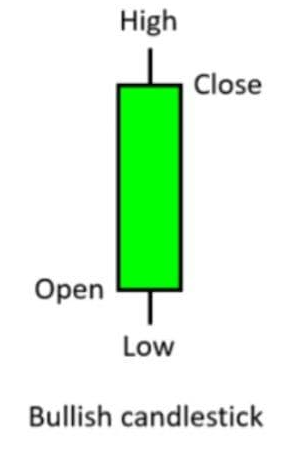

Every candle has a body and a couple of wicks (vertical top and bottom lines).
The candle body marks the difference between the opening and closing price. A short candle indicates that the open and close prices were quite close. A long candle indicates a big difference between the open and close prices.
The wicks on the candle show how high or how low the price has moved before the closing of the candlestick. As the price may have encountered support or resistance.
Support and Resistance
Support and resistance on a chart are used as a point of reference by traders for entry or exit of trades. They are often described as levels where multiple touches of price occur to the level without a full progression. This is often described as either breaking through or a breakpoint of the level of resistance or support.
A support level is where the price stops decreasing because it is supported by purchases.
A resistance level is where the price stops increasing as it is no longer being bought.
These levels exist due to an increase in buying or selling at various points on the charts. The fact that these levels can change between support or resistance can be used to indicate the range of a particular market as well as possible direction changes (trade reversals), movement change (breakouts), or return to previously reached level (bounce).
Lines are drawn by Traders on charts to identify support or resistance points as they buy at support and sell at resistance. The lines can also be used in analysis to predict future movements, they are often described as Trend lines.
Trend Lines
A trend line is a line that indicates the trajectory of a series of trades to identify what may occur in the future. The potential price as well as when that price will occur can be predicted using trend lines.
A trendline can be drawn by connecting the lows or highs in price. You need at least 2 points of contact to validate a trendline. The angle of the trendline determines the direction of the trend.
A downward sloping trendline on a trading chart for instance would suggest that the share has more participants willing to sell it, than to buy it.
In Summary, Charts are a useful tool to inform decisions on whether to buy or sell a digital asset